Ring33 stands out as an innovative force in the real estate sector, specializing in rent-to-buy solutions. This startup is transforming the millennial perspective on homeownership by combining the flexibility of renting with the benefits of owning. Central to Ring33’s approach is the conversion of a portion of monthly rent payments into a down payment, a strategy that embodies financial security, joy, and freedom. This unique model offers an accessible path to homeownership, enabling buyers to fulfill their housing aspirations with fewer sacrifices.
Since its inception, APART has been instrumental in developing Ring33’s brand identity. The agency took the lead in crafting the brand’s name and visual identity, delving into both Italian and global markets to identify distinct elements that would distinguish Ring33. The brand’s strategy centers on the inspiring concept “The house of your dreams is not a dream,” guiding the design and copywriting to vividly convey this philosophy.
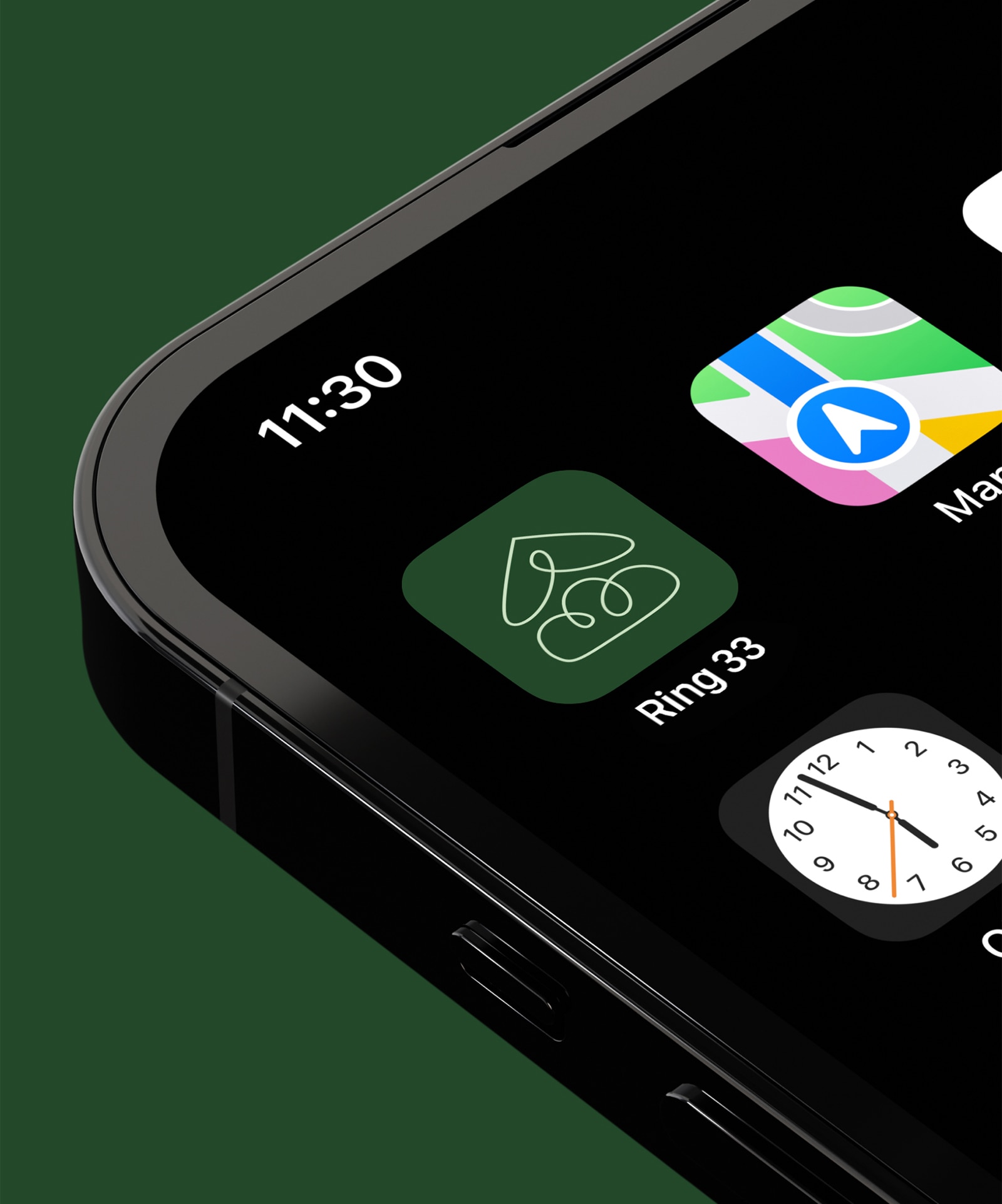
The visual identity of Ring33 is notably marked by its unique name. The number ’33’ symbolizes creativity and innovation, mirroring the brand’s goal of facilitating significant life changes, such as homeownership. The brand’s color palette is warm, modern, and comforting, aligning with its graphical and photographic elements. The logo features a house under a cloud-shaped roof, complemented by the compelling tagline “Don’t dream it. Own it.”, striking a balance between humor, practicality, and professionalism. This is matched with an informal yet distinctive typeface, resulting in a style that is minimalist, contemporary, and elegant, deeply resonating with Ring33’s target audience.
This project has honed APART’s expertise in copywriting, particularly in creating original names for innovative businesses. Ring33’s branding is a testament to APART’s ability to transform complex business models into an engaging and clear visual narrative. The brand represents a significant shift in the real estate industry, merging the emotional aspects of buying a home with a data-driven, logical approach.
Ring33’s introduction to the market marks a paradigm shift in real estate, combining technological savvy with a deep understanding of customer desires. The brand epitomizes innovation, empowerment, and practicality, reflecting the changing needs of modern homebuyers and redefining the concept of homeownership for a new generation.