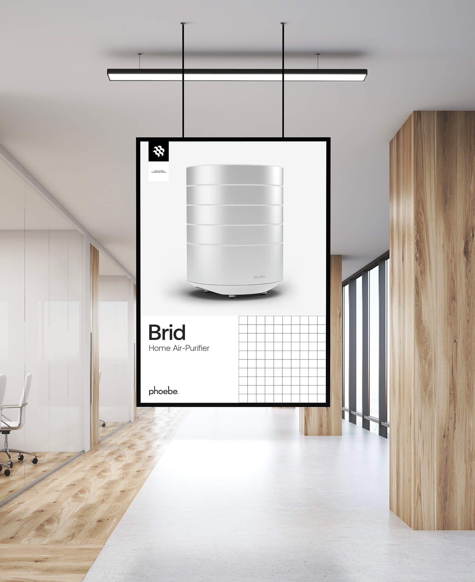
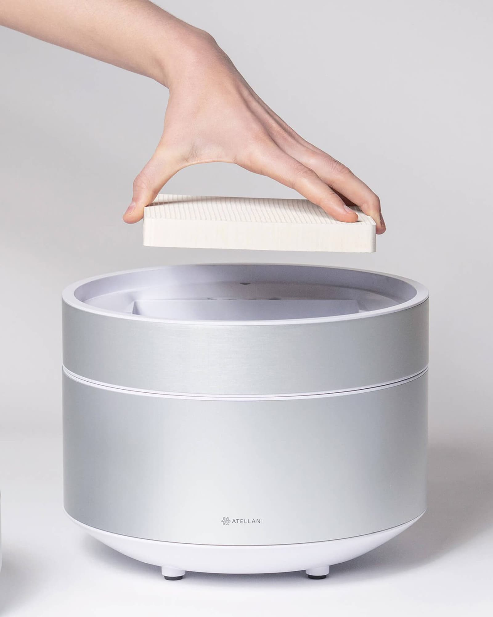
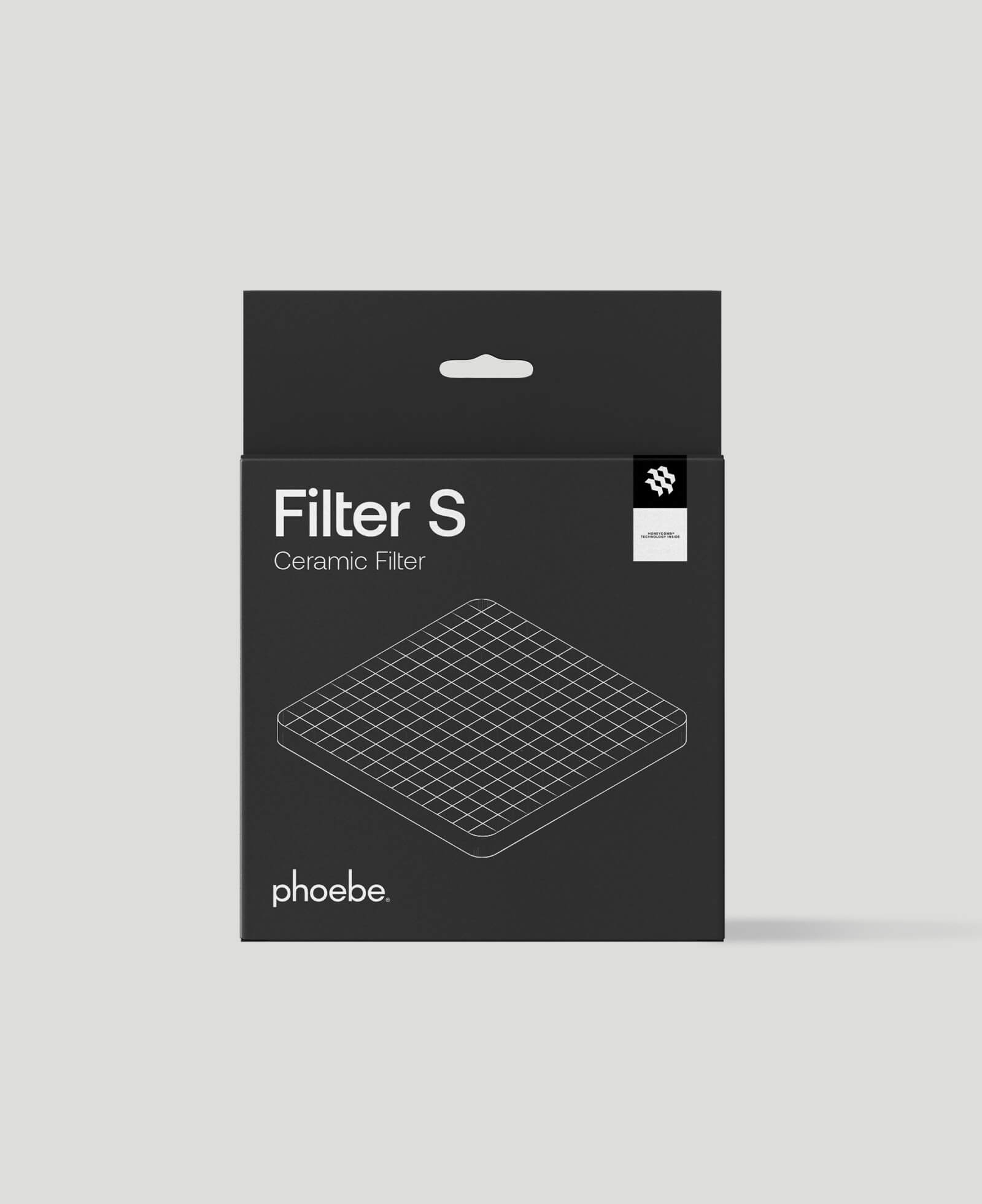
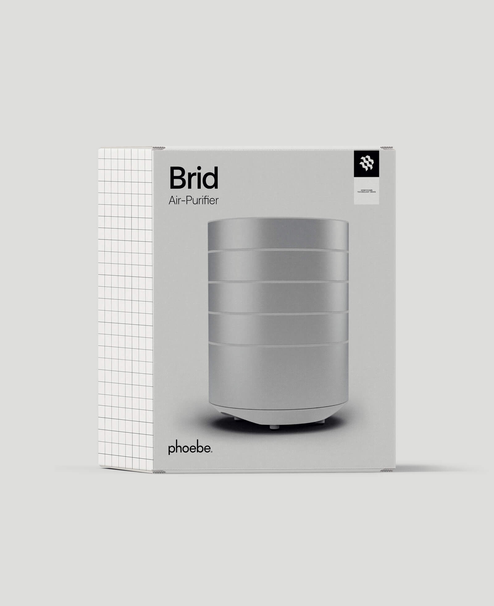
Phoebe, a venture born from the Colorobbia Group’s expertise in ceramics, represents a groundbreaking entry into the air purifier market. Utilizing Colorobbia’s extensive knowledge in ceramics, Phoebe introduces an innovative air purification method using patented photocatalytic oxidation technology. This method, inspired by beehive geometry, involves treating ceramic filters with titanium dioxide (TiO2) and activating them with tailored visible light, combining advanced science with ecological responsibility.
In their collaboration, APART was tasked with the complex challenge of integrating Phoebe’s sophisticated technology into a simple and coherent brand identity. The goal was to encapsulate Phoebe’s revolutionary technology in a visually appealing and understandable manner. APART handled Phoebe’s entire visual identity, covering logo design, graphic systems, packaging, and the development of an e-commerce-optimized website. The focus was on creating a design language that reflected the product’s advanced features while maintaining an accessible and engaging brand narrative.
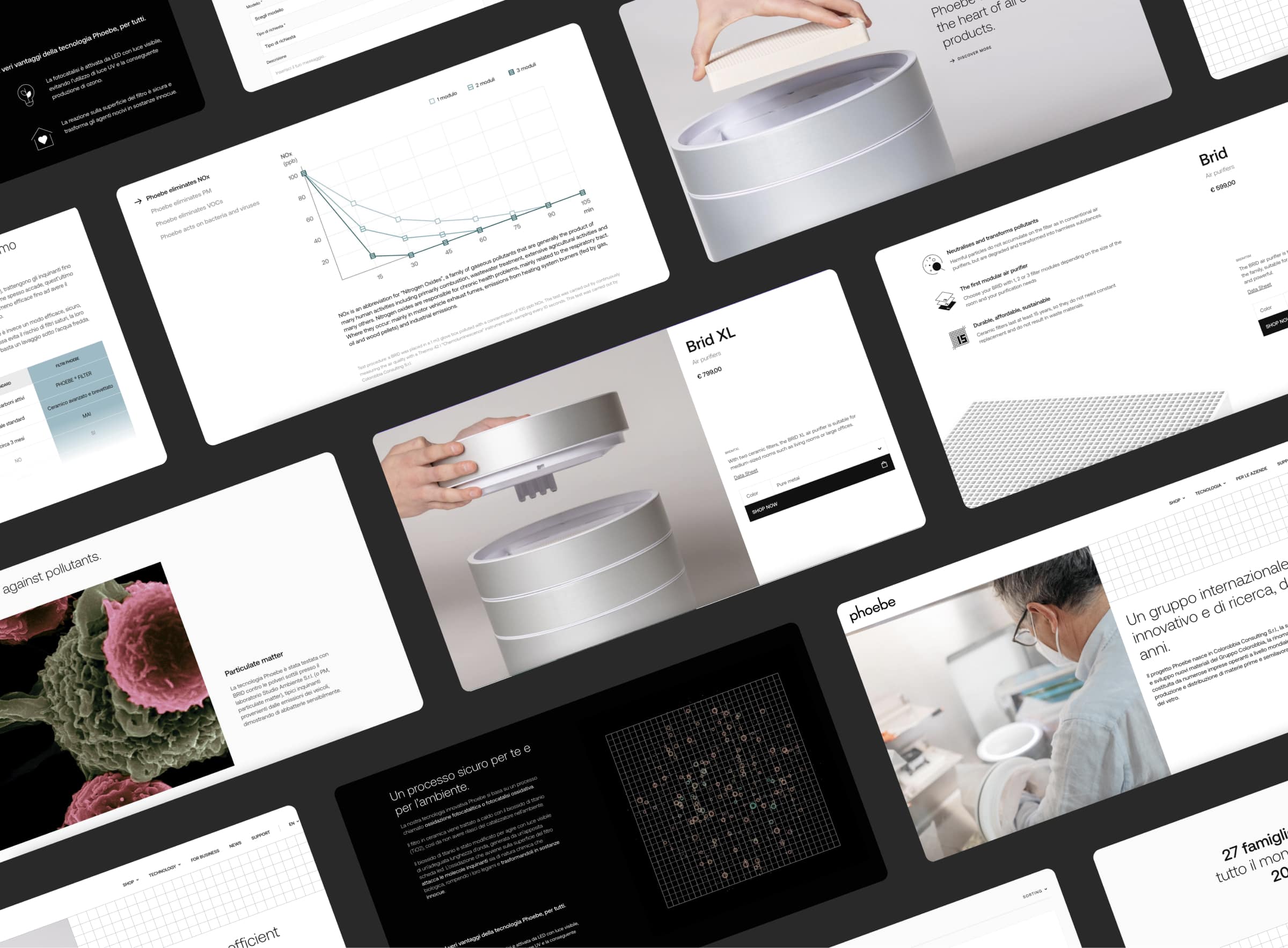
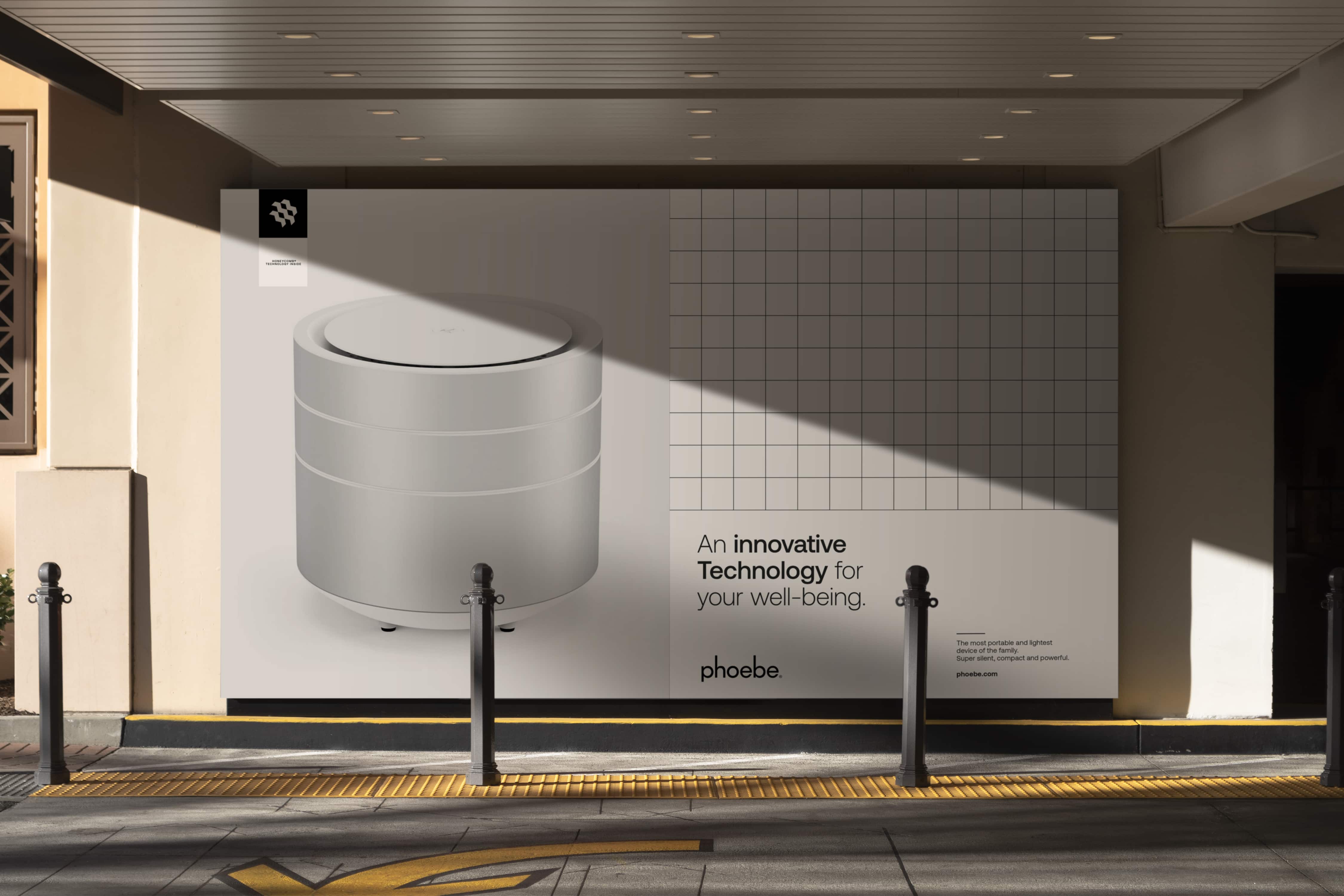
Phoebe’s visual identity is a testament to the power of minimalist design in conveying complex technological concepts. The logo, with its subtly elongated letter parts, signifies aspirations for cleaner air, aligning with the brand’s mission. The graphic system, based on a grid pattern, not only reflects the technological aspect of the product but also categorizes it through a thoughtful color scheme. This grid motif extends to all aspects of Phoebe’s communication, including product catalogs and advertising campaigns.
The website’s design strikes a balance between providing detailed information on Phoebe’s innovative technology and offering a seamless e-commerce experience. Interactive elements and 3D videos on the site demystify the advanced technology, making it more accessible to consumers.
Phoebe’s design philosophy centers on combining technological sophistication with visual simplicity. This approach was key in presenting the brand’s advanced air purification process in a way that connects with consumers, keeping the focus on clean air.
This project highlights the importance of a balanced visual identity that effectively translates complex innovations into a user-friendly narrative. APART’s work with Phoebe exemplifies how thoughtful design can bridge the gap between advanced technology and consumer engagement, setting new standards in the air purification market.
CREDITS
3D: Luca Carsenzuola