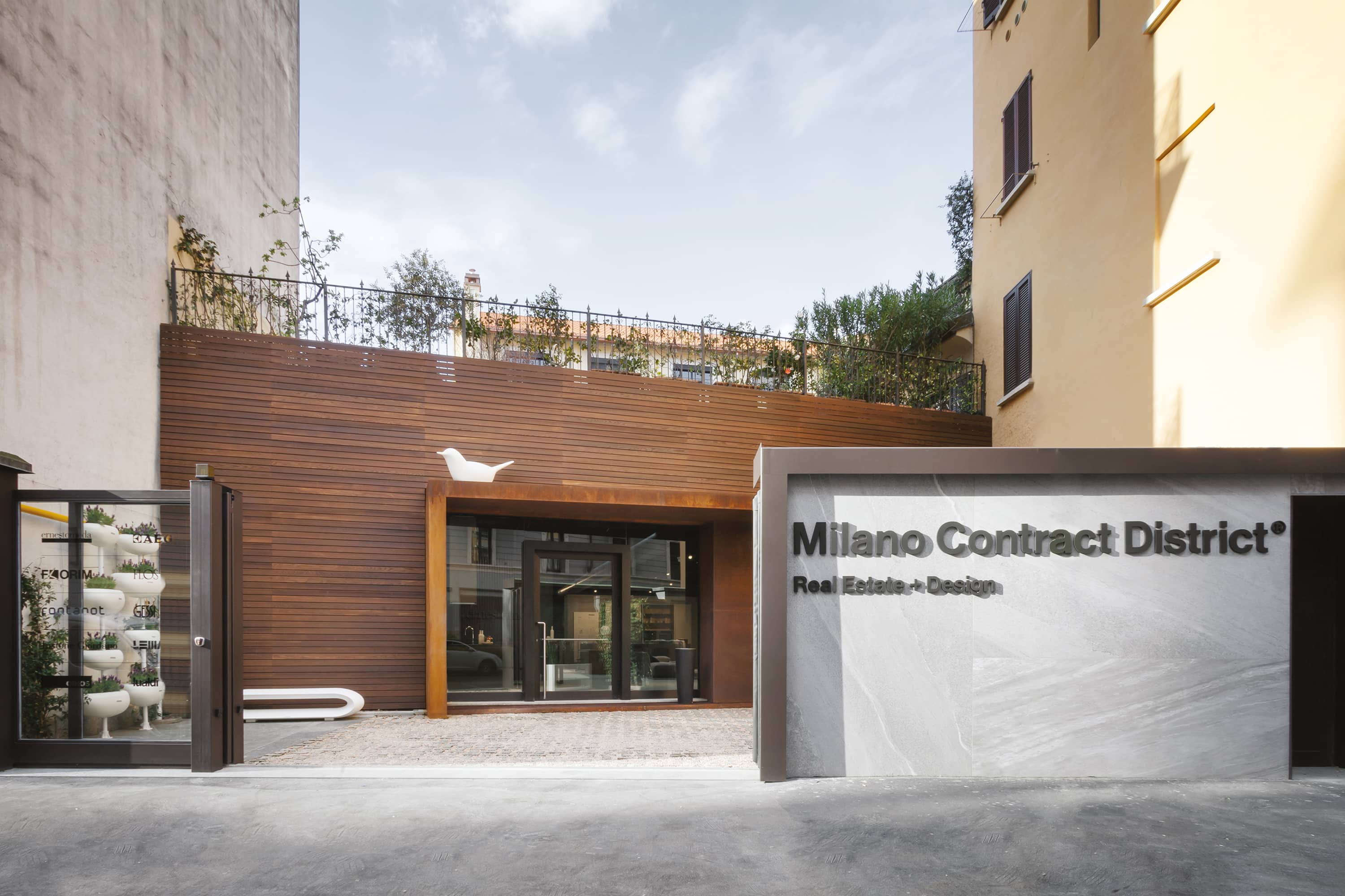
Milano Contract District, established in 2016, marked a revolution in the real estate landscape as the first design district devoted to this sector. It introduced an innovative B2B2C model that seamlessly blends home design with real estate, enabling buyers to easily realize their dream homes. This venture represents a significant shift from the traditional Contract System, uniquely combining home interiors and finishes to cater to the residential real estate market’s needs.
From the beginning, APART played a key role in developing Milano Contract District’s visual identity and website. The challenge was to capture the concepts of “modularity” and “personalization” within the design, effectively communicating the brand’s unique offerings. APART’s input was vital in ensuring the brand’s innovative business model was clearly and attractively represented through its design.
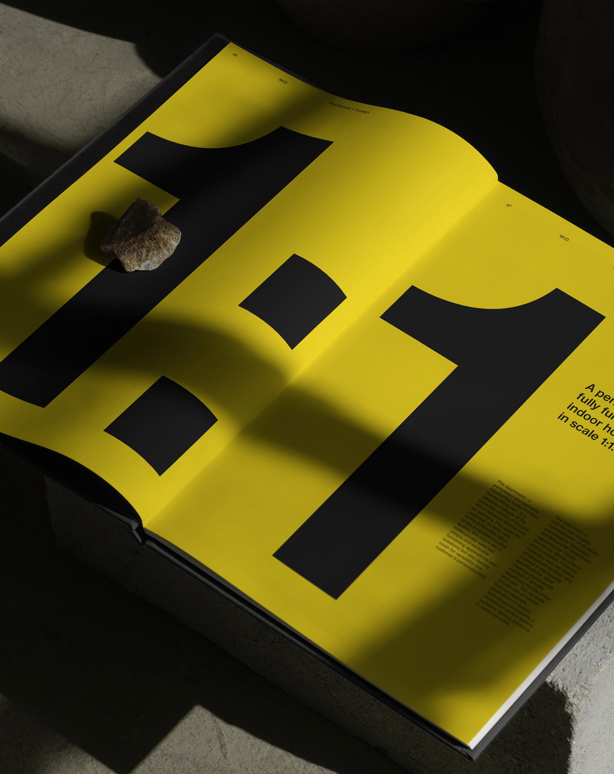
Milano Contract District’s visual identity stands out with its vibrant yellow color scheme and bold, precise typography. The graphic system, featuring endless outlines of property floor plans, mirrors the brand’s ethos and its founders’ vision. This design approach, combined with the exceptional product quality offered by its partners, underscores the brand’s unique role in adding value at every stage of real estate development. The website is distinguished by its innovative and user-friendly layout, effectively meeting the needs of clients seeking quick and clear information while accommodating the company’s diverse communication requirements.
Every graphic and aesthetic element was carefully crafted to reflect the essence of the business and its people. The distinctiveness and aesthetic appeal of the visual identity have significantly streamlined and enhanced the brand awareness process.
Just two years after its launch, Milano Contract District was honored as one of the “Excellences of Lombardy” by the Lombardy Region, acknowledging its substantial impact on the market.
This project highlights the critical importance of design in making a brand’s story more comprehensible and accessible. Milano Contract District’s success underscores the essential role of design in clearly and effectively conveying a brand’s unique selling points and value to its target audience.