Since its visionary inception by Giovanni Sgariboldi in 1978, EuroItalia has emerged as a leader in the global beauty industry. Merging rich Italian heritage with a broad international scope, EuroItalia is renowned for its creation of iconic fragrances and beauty cosmetics, both independently and through prestigious licensed collaborations. The brand is lauded for its close partnerships with renowned fashion houses, crafting unique and unmatched concepts for fragrances and beauty products. With a steadfast dedication to research and development, EuroItalia boasts an impressive global reach. Its significant role in Lombardy’s cosmetics sector and its export success, accounting for over 90% of its business, further solidify its industry standing.
APART was tasked with refreshing EuroItalia’s visual identity, encompassing everything from logo redesign to a comprehensive website revamp, ensuring alignment with contemporary design trends. The challenge was to craft an identity that respected EuroItalia’s legacy, suited a B2B company in the luxury sector, and subtly complemented its client brands’ images. The objective was to create a brand identity that was both refined and rich in character, seamlessly cooperating with its business partners.
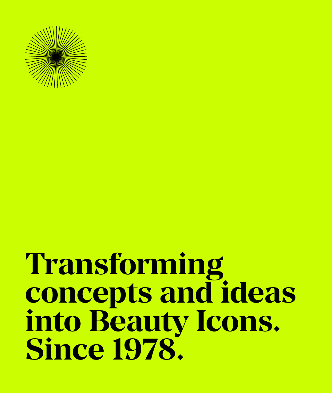
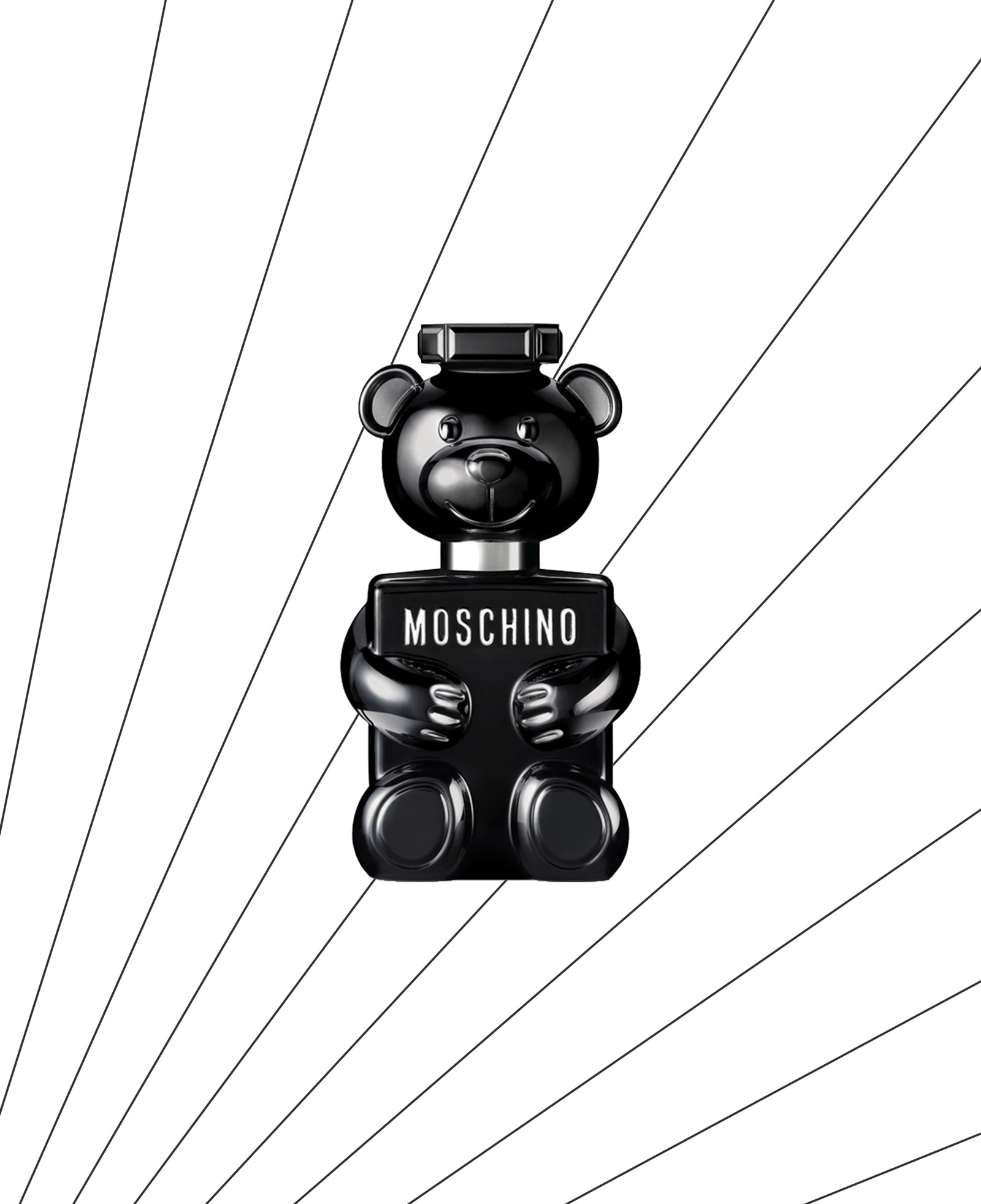
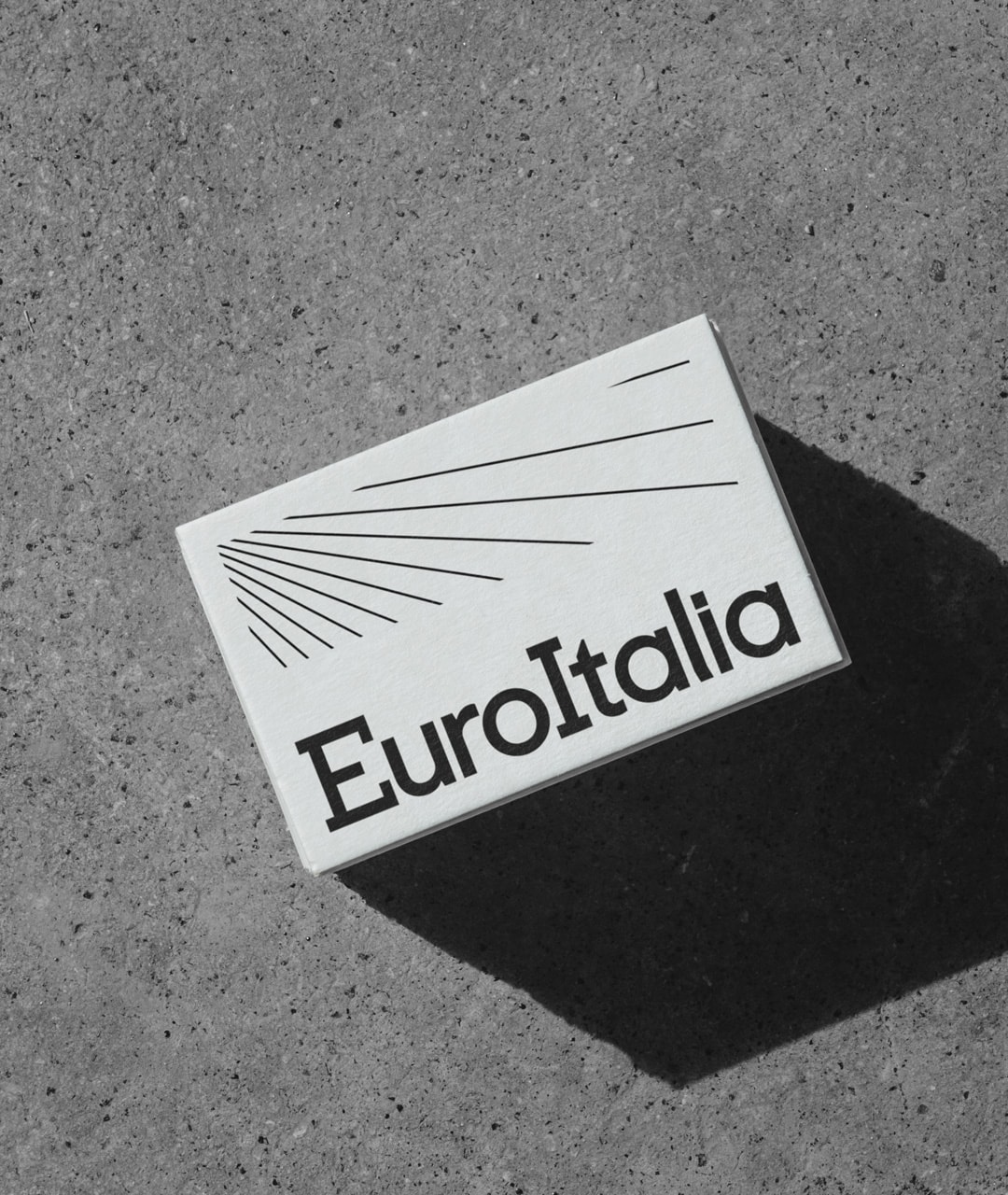
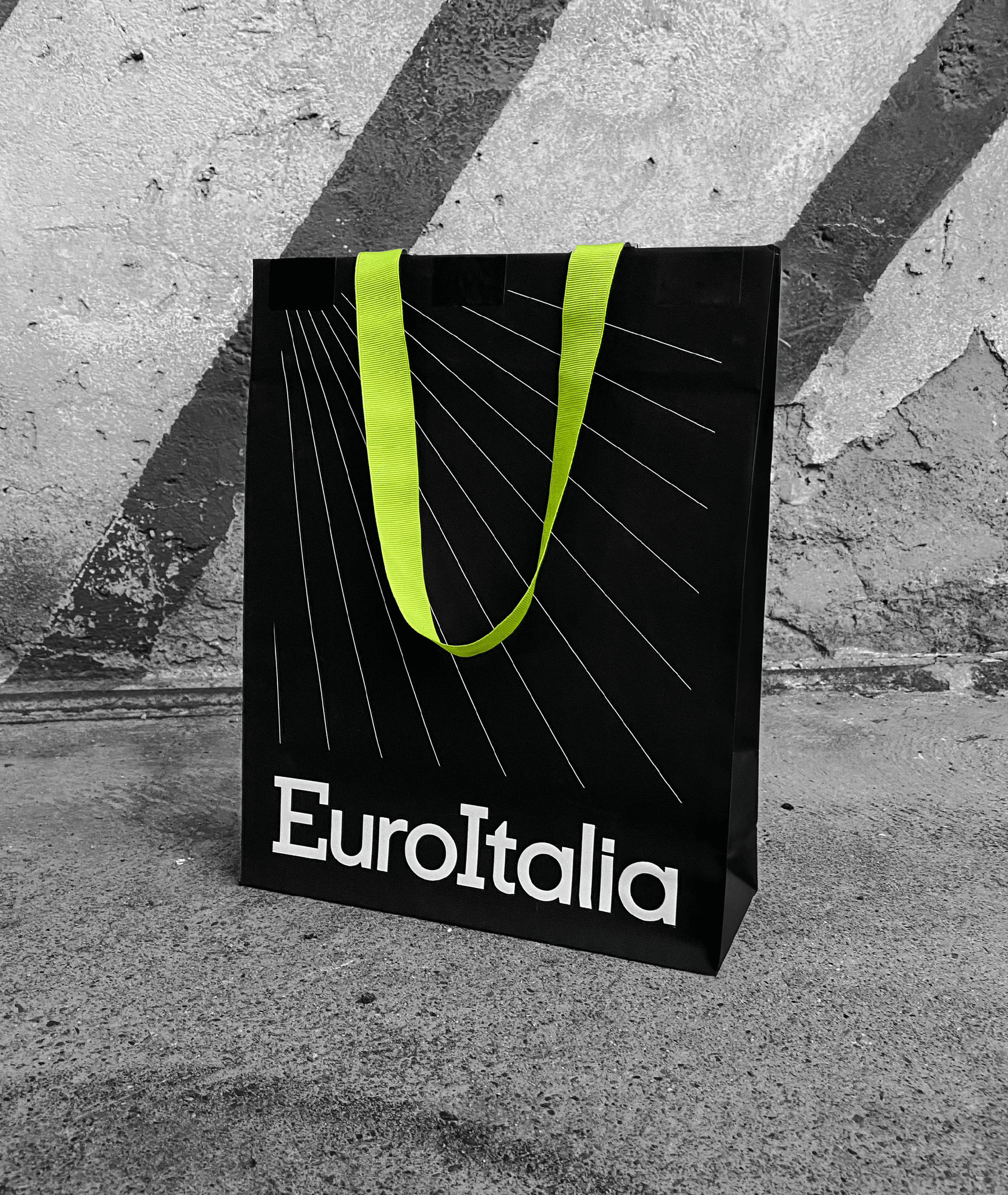
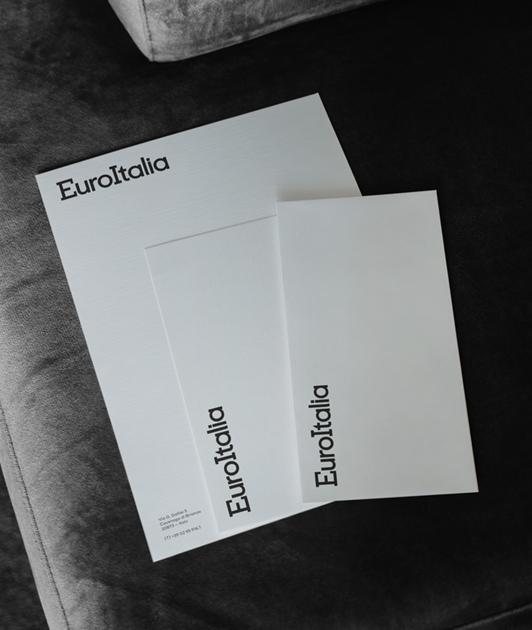
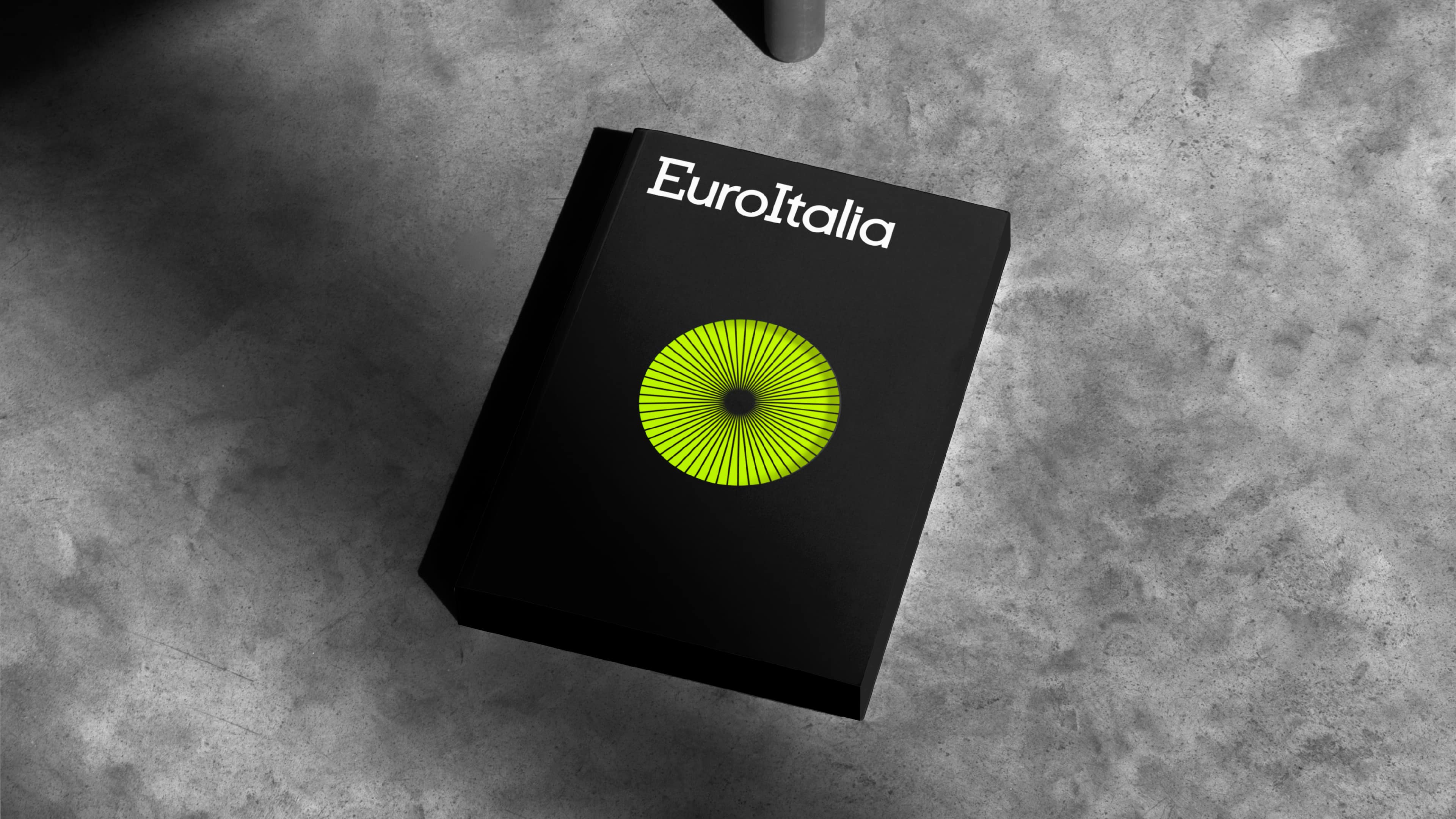
The logo’s redesign was carried out with a nod to its historical significance, focusing on refined spacing and serifs to modernize its look. The design approach embraced minimalism, using a limited palette of graphic elements: animated fine lines suggesting perfume mists, and a fresh, rejuvenating green, representing the Sgariboldi family’s enduring influence after more than forty years. This blend of playfulness and uniqueness endowed the brand identity with distinctiveness and memorability. The visual narrative of EuroItalia, illustrated on its website, is a fusion of luxury and elegance, achieved through geometric layouts, sophisticated typography, and a predominantly black & white color scheme, exuding a sense of high fashion.
APART’s efforts have successfully revamped EuroItalia’s image, aligning it with current global market trends and solidifying its prestigious standing. The Sgariboldi family’s trust in APART enabled a smooth and swift rebranding process.
EuroItalia’s transformation stands as a powerful example of how a well-developed visual identity can elevate a company’s profile and ensure its relevance in a constantly evolving market. This project not only emphasizes the need to adapt to market trends but also showcases APART’s skill in striking a fine balance between honoring heritage and embracing contemporary aesthetics.