Emerging from the creative hub of Italian digital publisher Freeda, Superfluid marks a refreshing chapter in the beauty and skincare industry. Launched as a spin-off in 2017, Superfluid has redefined skincare with an authentic, unburdened approach, championing self-acceptance and love. Unique in the beauty sector, it collaboratively designs with its community to provide 100% vegan, cruelty-free products, all proudly made in Italy. Superfluid celebrates diverse beauty, appealing to a broad range of individuals and inspiring creativity in self-identity exploration.
APART played a pivotal role in shaping Superfluid’s distinct character from the very start. The agency was responsible for developing the brand’s name, visual identity, packaging, and creative direction, closely aligning with the brand from its conceptual stages to its market debut.
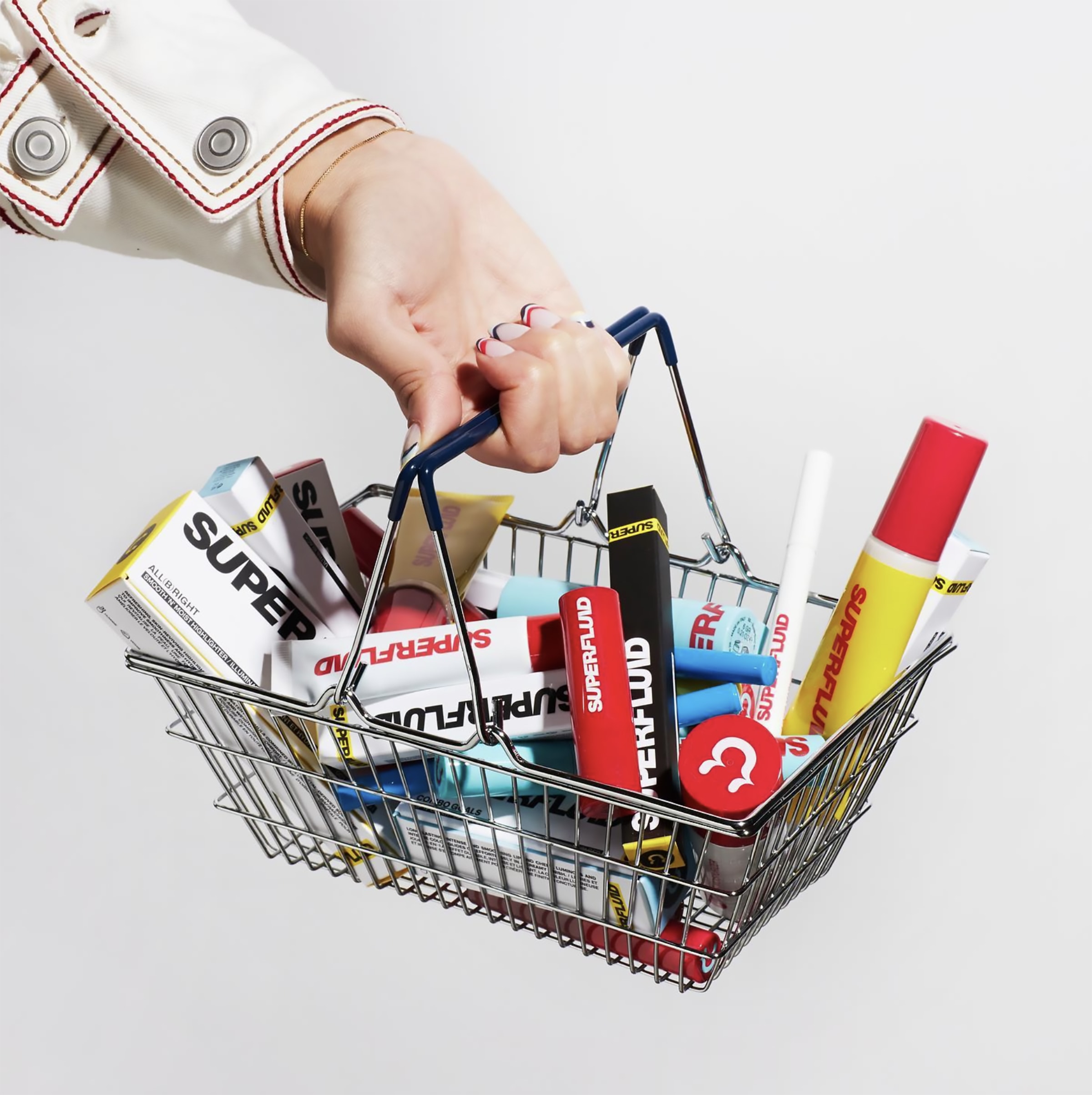
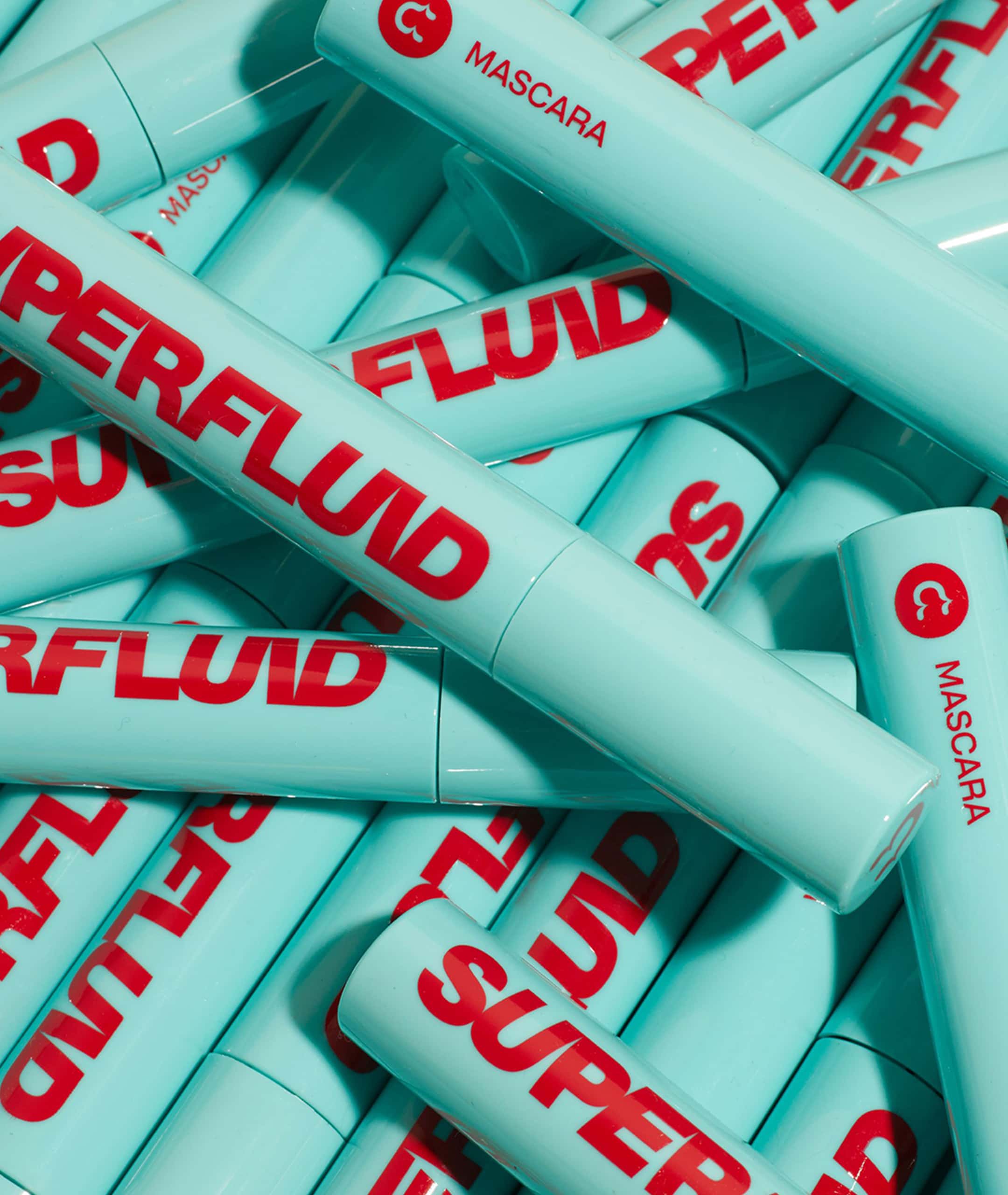
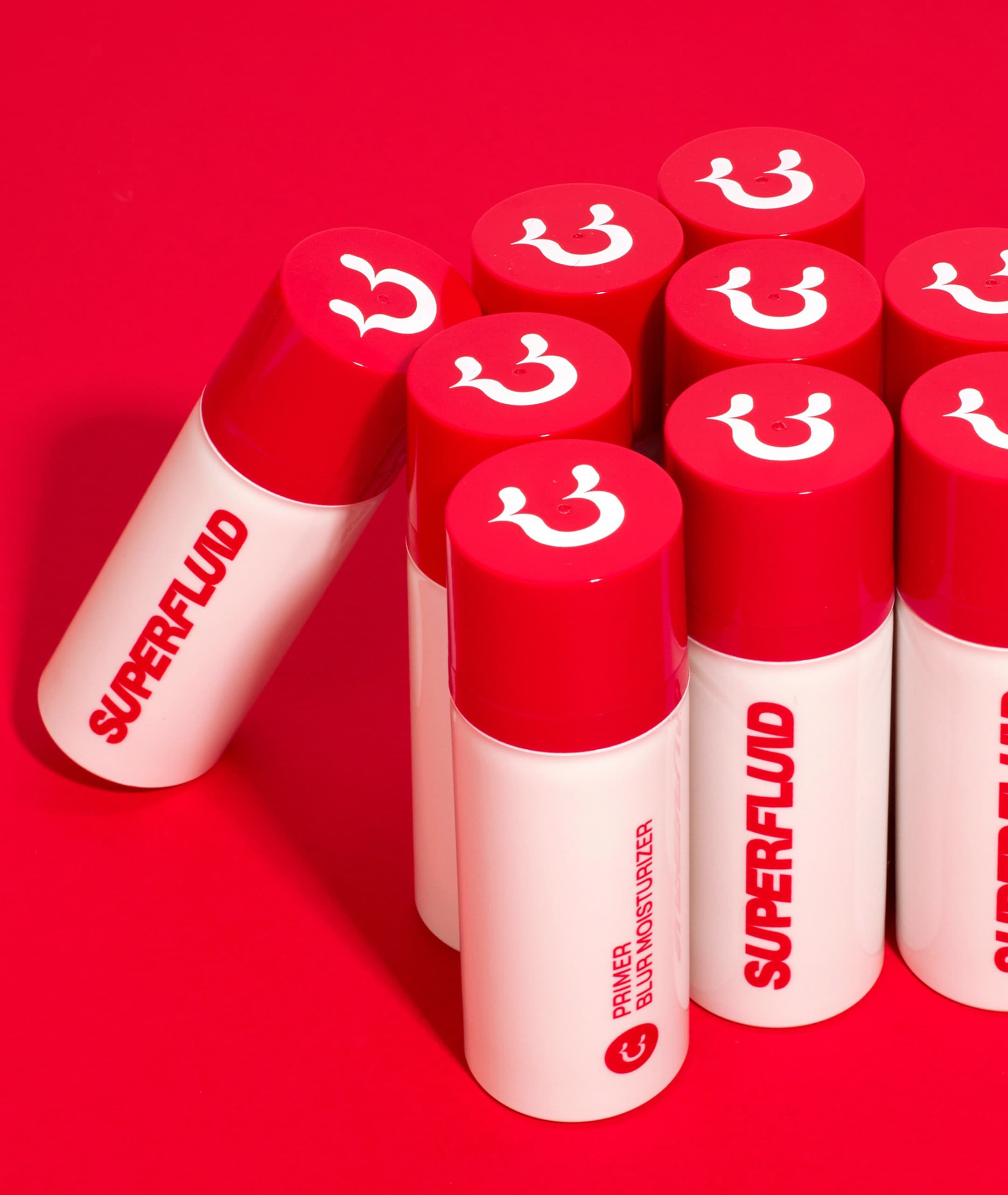
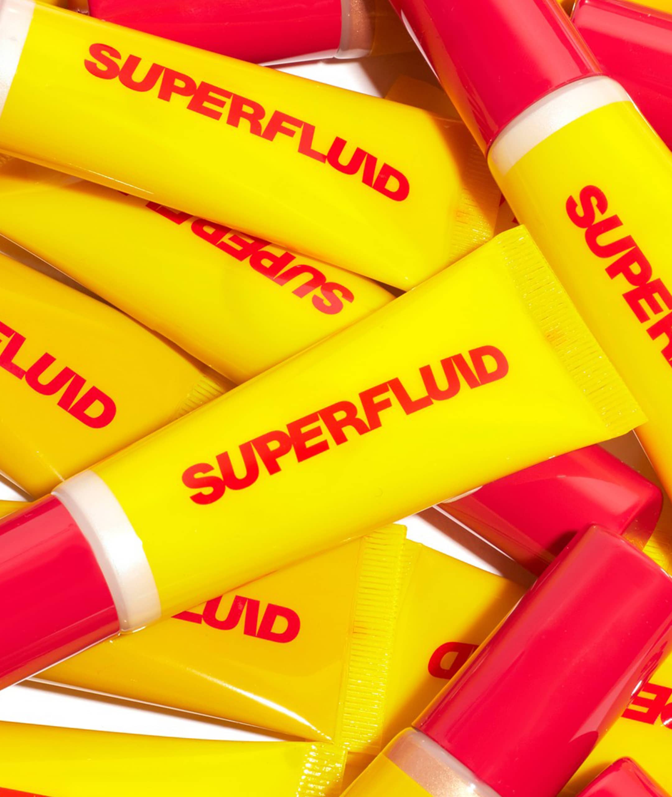
Superfluid’s visual identity is characterized by a playful logo, a lively tri-color palette, and a distinctive pictogram, all capturing its spirited nature. The concept of fluidity is central to the brand, reflected in a color scheme that avoids a single primary color, instead creating a dynamic, evolving visual language. The brand name, ‘Superfluid’, and its logo, which combines angled and standard typography, represent the brand’s flexible and adaptive personality. The ‘smeared icon’ pictogram, depicting a winking face with smeared makeup that incorporates the letter ‘U’, cleverly emphasizes the brand’s human-focused ethos.
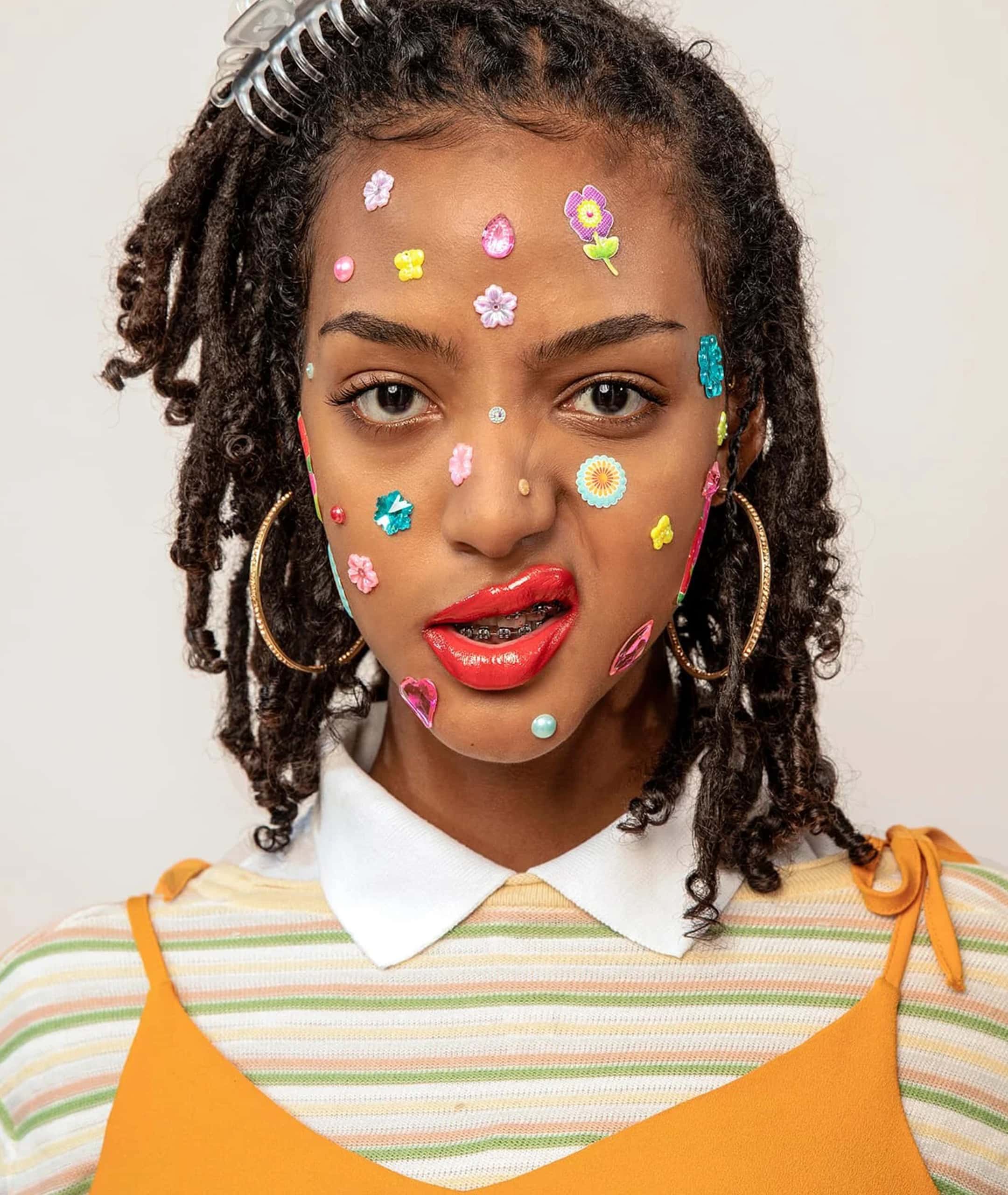
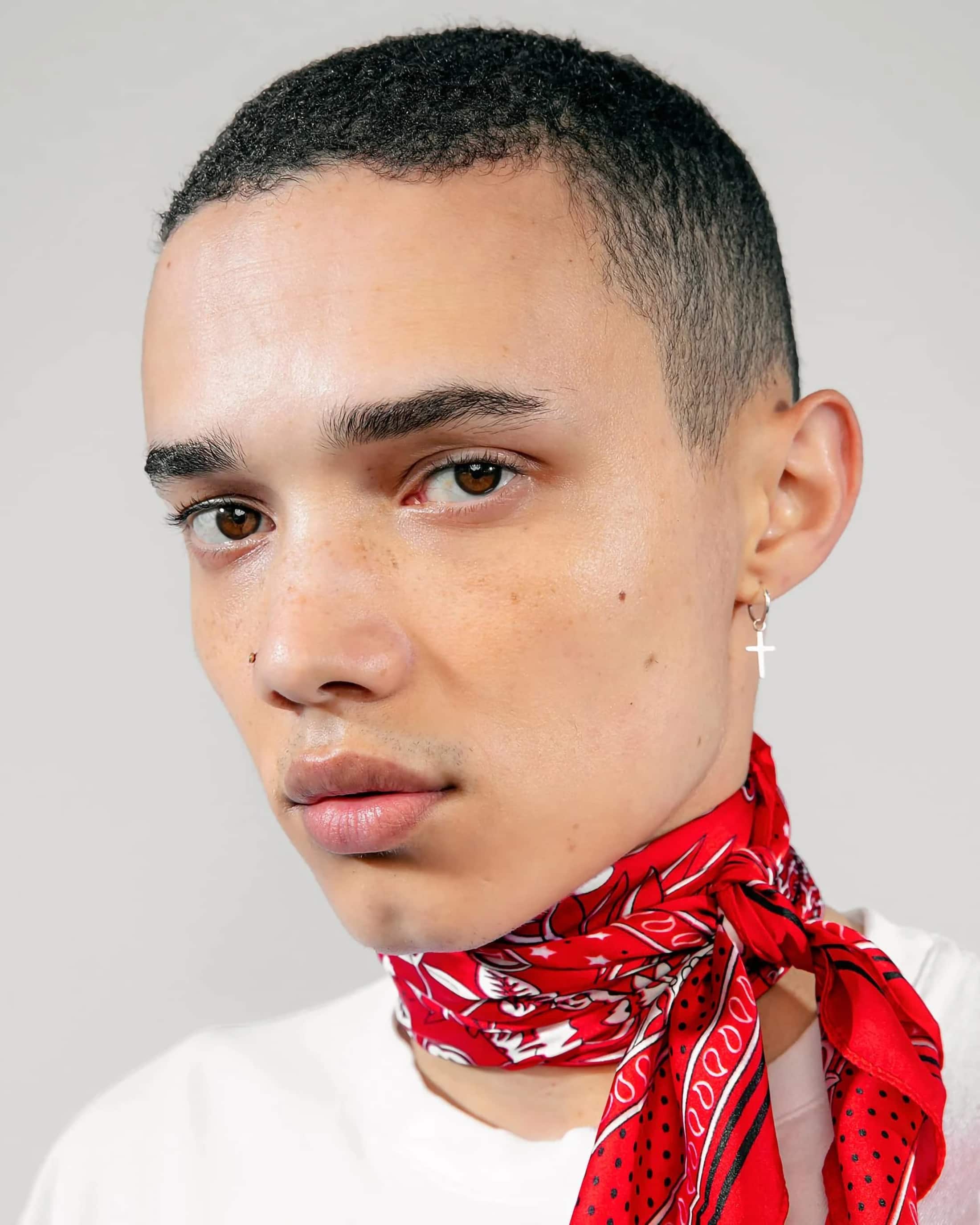
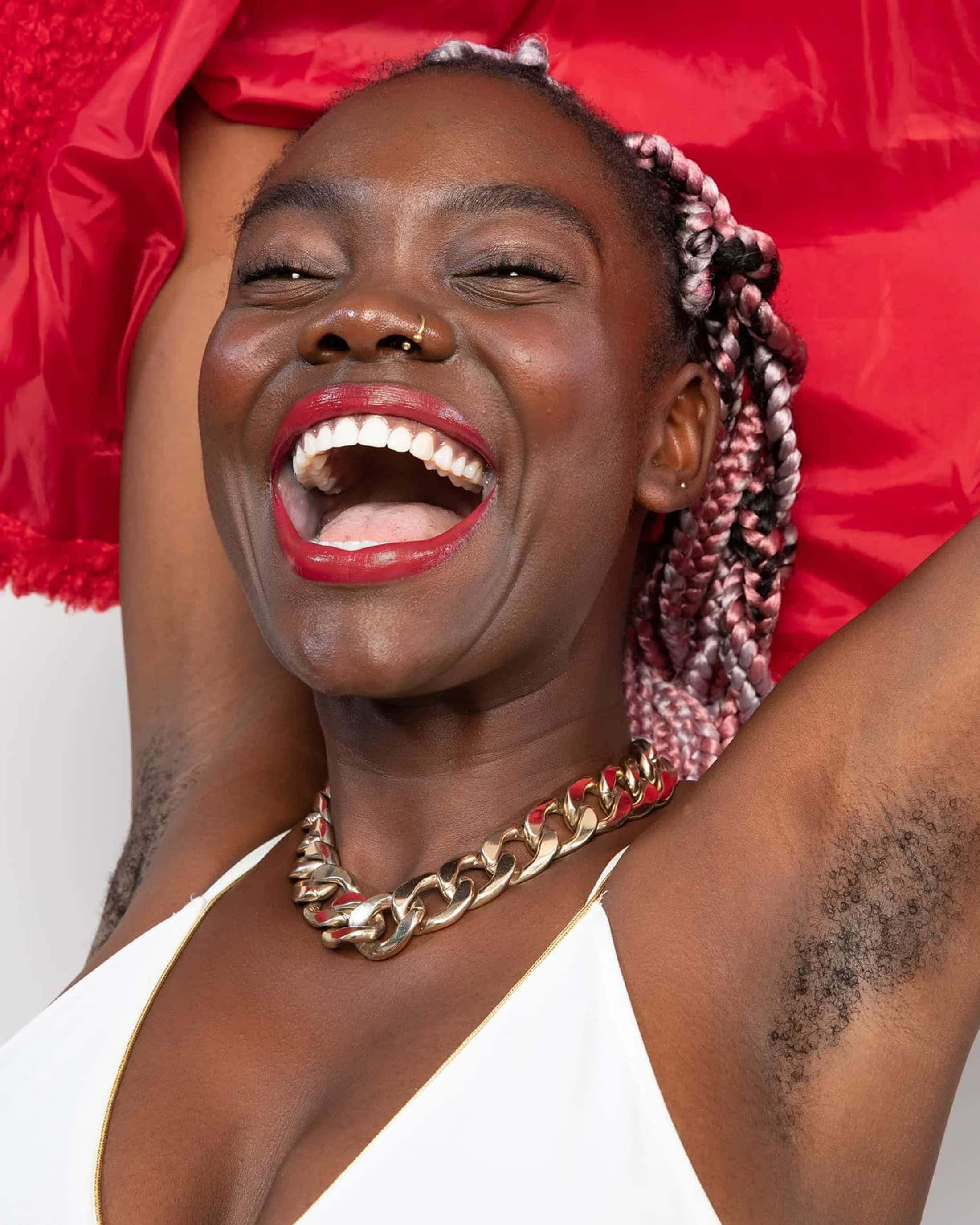
The brand’s photographic narrative, led by Manesha Caldi Smith in South Africa, aligns perfectly with Superfluid’s core values. The diverse range of models in the imagery echoes Superfluid’s varied audience, adding authenticity to the brand’s storytelling. This alignment with the target demographic was crucial for creating marketing content that resonates and has a meaningful impact.
Superfluid’s journey in the evolving beauty and skincare sector represents a story of continuous growth and potential. The brand stands out as a symbol of genuine engagement with its audience, adeptly navigating the changing tides of beauty trends with a commitment to authenticity and inclusivity.
CREDITS
Photo: Manesha Caldi Smith