Superfluid
A Fluid Take on Beauty and Self-Expression
Born from Freeda’s understanding of Millennials and Gen Z, Superfluid set out to bring an inclusive vision of beauty to a crowded cosmetics market. We shaped its name, visual identity and packaging around the idea of fluidity, carrying the same expressive attitude from the products themselves to social feeds and retail.
Launched in Italy in 2020 by social-first publisher Freeda, Superfluid introduced a range of makeup and skincare products, from brow gels and mascaras to lip balms and moisturisers. Vegan, cruelty-free and Made in Italy, the collection was sold through direct-to-consumer e-commerce and selected retailers. With a limited advertising budget, the brand needed a distinctive identity capable of communicating its values across every touchpoint.
Having developed Freeda’s identity and creative direction, we were already familiar with its Millennial and Gen Z audience. We built Superfluid around fluidity, understood as freedom of self-expression beyond established aesthetic and gender conventions. This principle informed the naming, visual identity and packaging, giving the brand a clear personality from the outset.
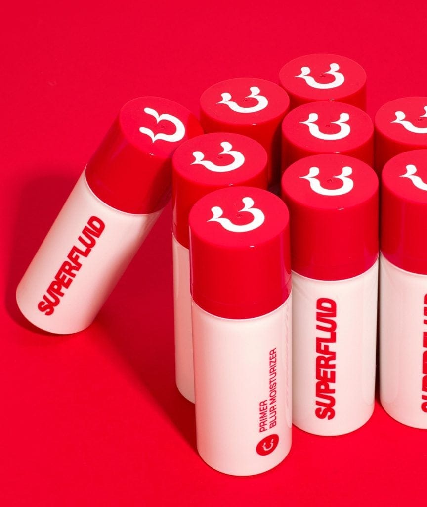
We developed a pop yet minimal graphic language anchored in yellow, an unconventional primary colour in cosmetics that expressed the brand’s optimistic outlook. Two vivid secondary colours expanded the palette. The logotype combines regular and angled letterforms to suggest movement and adaptability. A winking face, featuring deliberately smudged makeup and an integrated letter U, became the brand’s pictogram, expressing a playful attitude towards imperfection. Product names such as “So Far So Smooth”, “All(b)right” and “Combo Goals” extended the same conversational tone across the collection.
Creative direction carried these principles into the launch campaign, photographed in South Africa by Manesha Caldi Smith. A diverse cast, individual styling and carefully chosen settings brought different personalities into focus. Primary and secondary packaging followed the same approach, with essential forms, vivid colours and clear graphic elements. Recyclable paper packaging reflected the brand’s attention to sustainability, while its expressive design made the products well suited to unboxing and social sharing.
From naming and photography to packaging and brand guidelines, we established a consistent identity across social content, e-commerce and selected retail environments, giving Superfluid’s values of inclusivity and self-acceptance a tangible expression.
IN BRIEF
Naming
Visual Identity
Art Direction
Packaging
CREDITS
Photo: Manesha Caldi Smith
AWARDS
ADCI Awards 2020, Brand Identity — Silver
Born from Freeda’s understanding of Millennials and Gen Z, Superfluid set out to bring an inclusive vision of beauty to a crowded cosmetics market. We shaped its name, visual identity and packaging around the idea of fluidity, carrying the same expressive attitude from the products themselves to social feeds and retail.
Launched in Italy in 2020 by social-first publisher Freeda, Superfluid introduced a range of makeup and skincare products, from brow gels and mascaras to lip balms and moisturisers. Vegan, cruelty-free and Made in Italy, the collection was sold through direct-to-consumer e-commerce and selected retailers. With a limited advertising budget, the brand needed a distinctive identity capable of communicating its values across every touchpoint.
Having developed Freeda’s identity and creative direction, we were already familiar with its Millennial and Gen Z audience. We built Superfluid around fluidity, understood as freedom of self-expression beyond established aesthetic and gender conventions. This principle informed the naming, visual identity and packaging, giving the brand a clear personality from the outset.
We developed a pop yet minimal graphic language anchored in yellow, an unconventional primary colour in cosmetics that expressed the brand’s optimistic outlook. Two vivid secondary colours expanded the palette. The logotype combines regular and angled letterforms to suggest movement and adaptability. A winking face, featuring deliberately smudged makeup and an integrated letter U, became the brand’s pictogram, expressing a playful attitude towards imperfection. Product names such as “So Far So Smooth”, “All(b)right” and “Combo Goals” extended the same conversational tone across the collection.
Creative direction carried these principles into the launch campaign, photographed in South Africa by Manesha Caldi Smith. A diverse cast, individual styling and carefully chosen settings brought different personalities into focus. Primary and secondary packaging followed the same approach, with essential forms, vivid colours and clear graphic elements. Recyclable paper packaging reflected the brand’s attention to sustainability, while its expressive design made the products well suited to unboxing and social sharing.
From naming and photography to packaging and brand guidelines, we established a consistent identity across social content, e-commerce and selected retail environments, giving Superfluid’s values of inclusivity and self-acceptance a tangible expression.




Related Projects


Giving a Universal Idea a Distinctive Personality
Giving a Universal Idea a Distinctive Personality
Giving a Universal Idea a Distinctive Personality