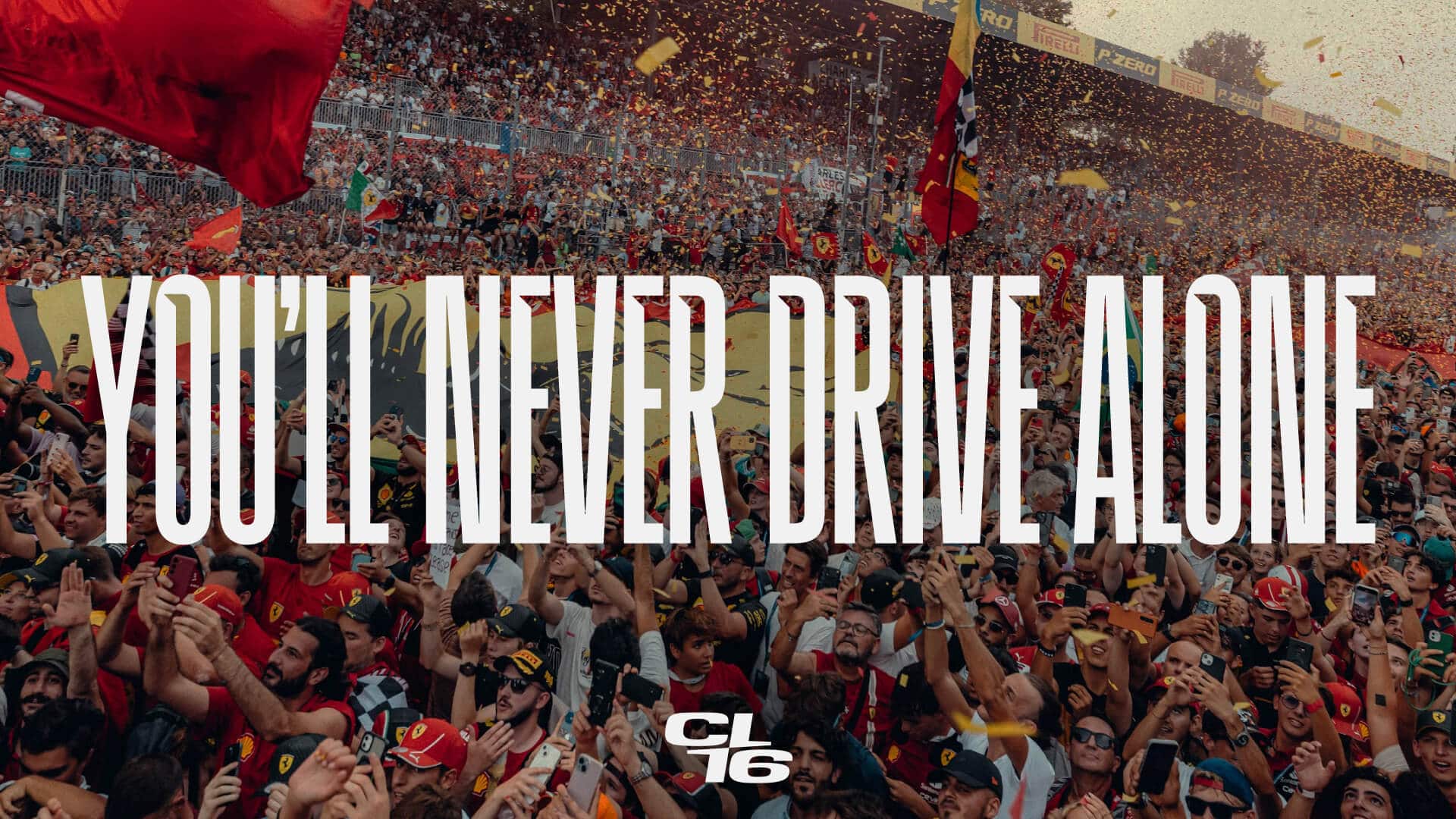
In a world where design shapes identity and athletes become cultural icons, Charles Leclerc’s visual identity emerges as a masterclass in blending racing heritage with modern sophistication. As Formula 1 transforms into a global stage for both competition and personal storytelling, capturing Leclerc’s dual persona—the relentless driver and the charismatic man—is essential.
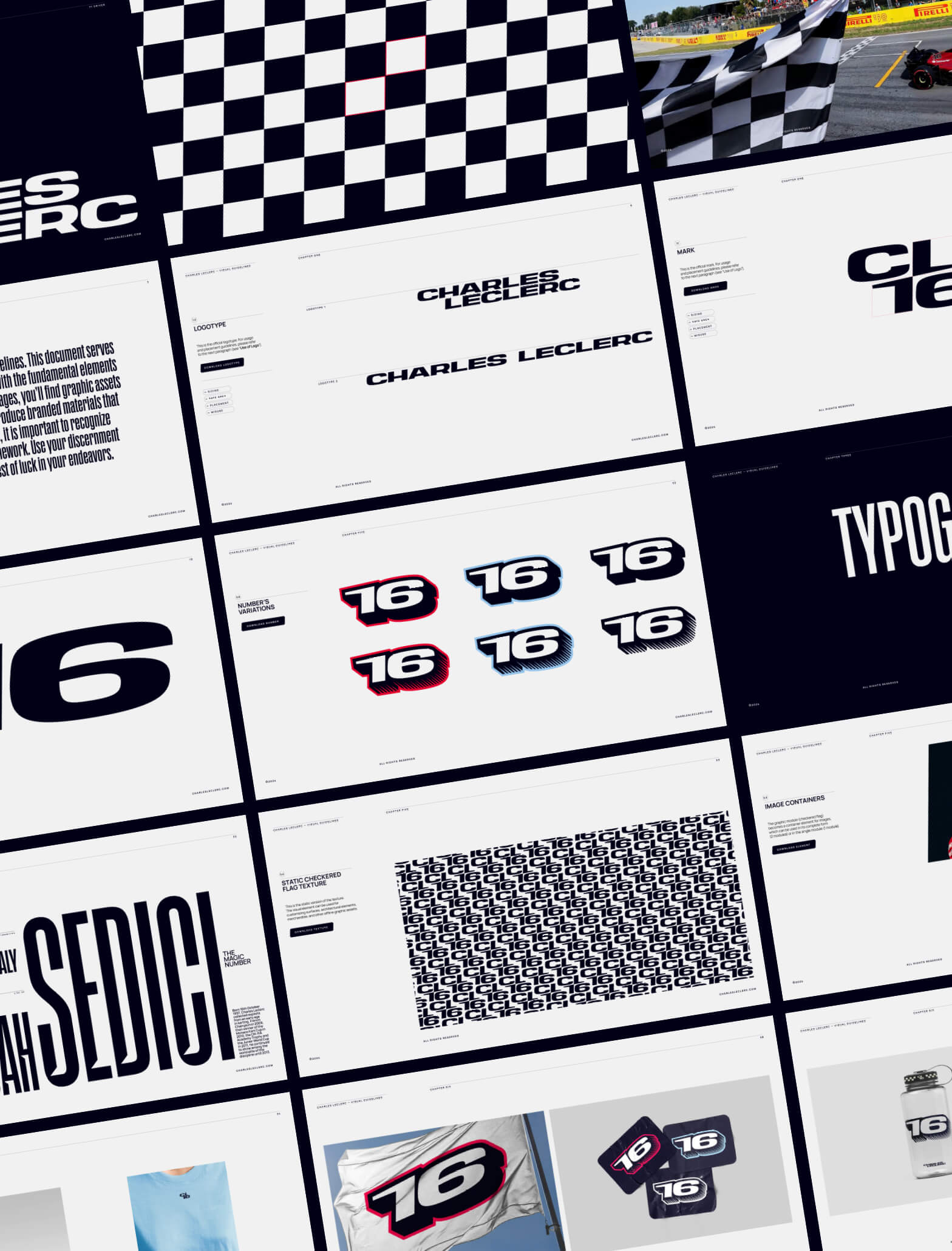
Drawing inspiration from one of motorsport’s most enduring symbols, the new graphic identity harnesses the power of the checkered flag. First unveiled in 1906, this emblem has long signified more than the end of a race—it embodies passion, precision, and the relentless pursuit of excellence. By reimagining its energy and legacy, the identity pays homage to racing’s purest traditions while crafting a distinct, contemporary narrative for Charles Leclerc.
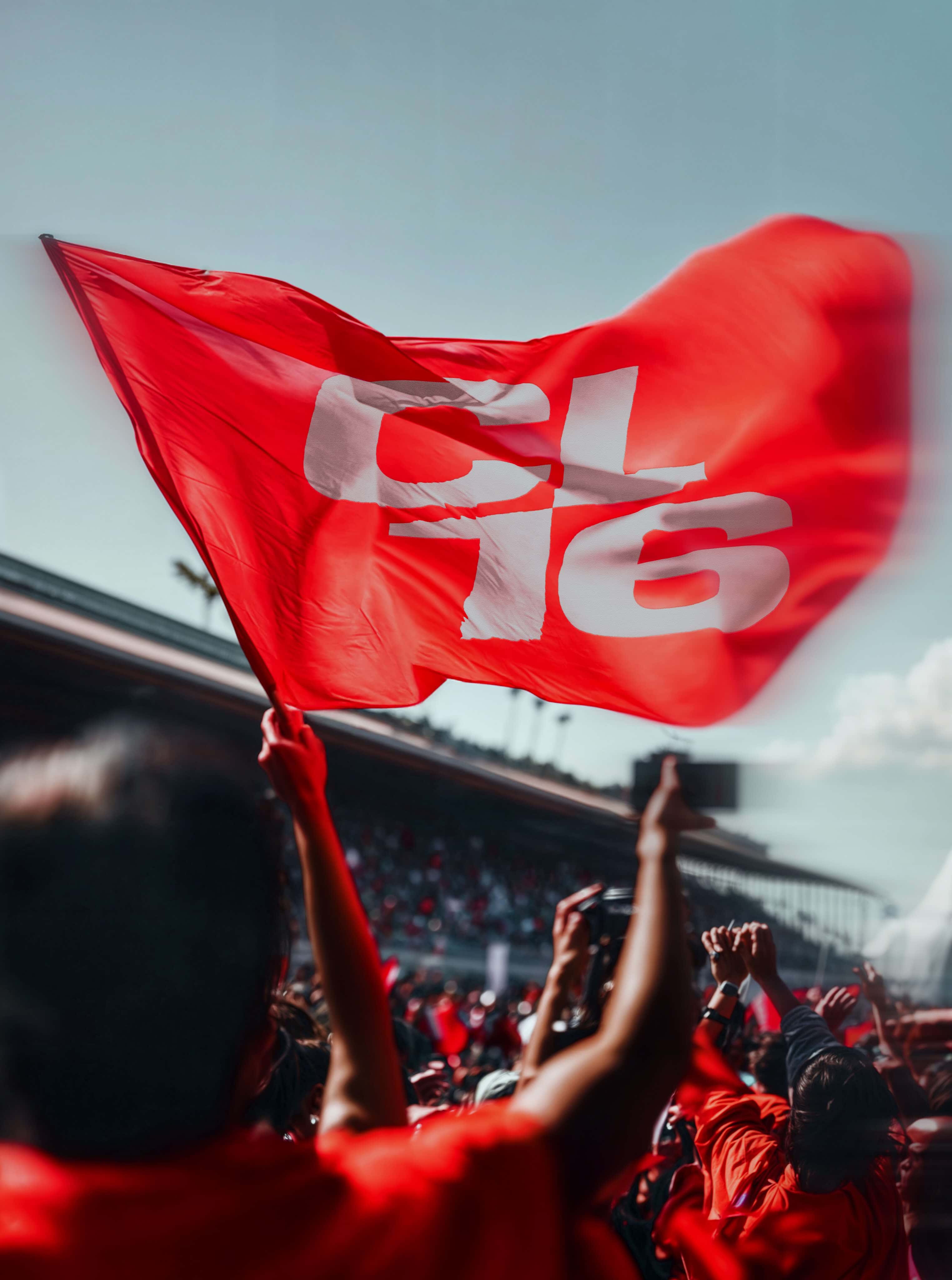
At its core, the design distills the iconic checkered pattern into its elemental form. Through a dynamic rotation, the simplified motif reveals the CL16 mark, where the letter “L” seamlessly intertwines with the number “1.” This visual fusion nods to Leclerc’s enduring nickname, “Il Predestinato,” and lays the foundation for the bold “CHARLES LECLERC” logotype, presented alongside the timeless number 16. A carefully curated color palette further enlivens the design, capturing the vibrant energy of the racetrack while echoing the personal nuances of his journey.
Complementing the graphic elements is the bespoke typeface, Leclerc Sans. This condensed grotesk font, marked by distinctive triangular cuts at the letter junctions, offers a striking contrast to the horizontal lines of the logotype. More than a typographic choice, Leclerc Sans infuses the identity with dynamism and speed, offering multiple stylistic variants that reflect the high-octane spirit of motorsport.
The strategy behind the project emphasizes Charles’s youthful energy and his natural ability to connect. Whether through social media or in person, his innate charisma fosters authentic relationships with fans, reinforcing his image as a vibrant and inclusive force in the world of F1.
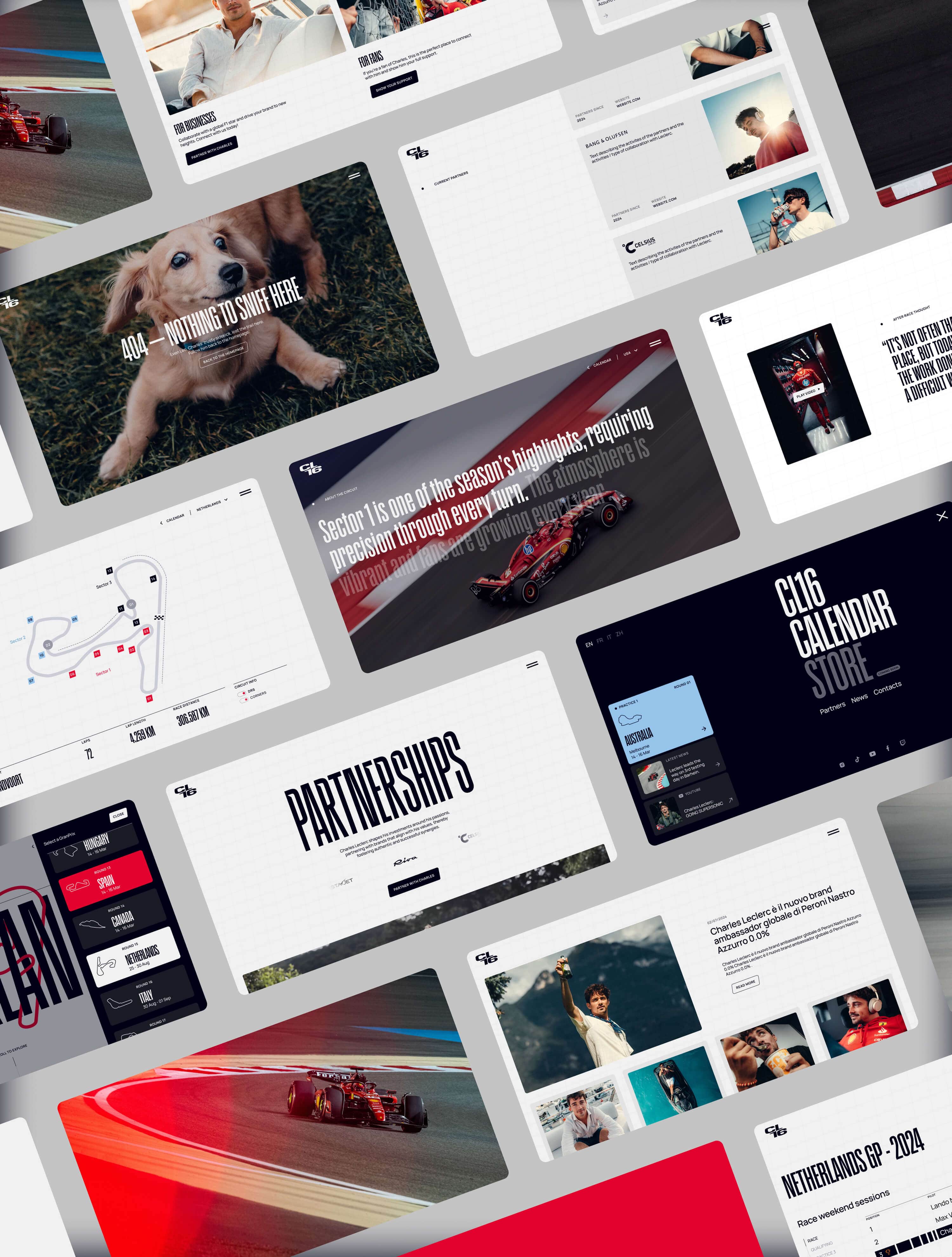
This duality is further explored through the website’s design, which unfolds across two complementary sections. The Driver page immerses users in a narrative structured around pivotal circuit milestones, with a navigation experience that mirrors the rhythm of a high-speed race. In contrast, The Man section adopts a fluid, journal-like format—where images, videos, and personal reflections converge to offer an intimate glimpse into Charles’s life beyond the track.
Technologically, the website exemplifies excellence and continuous evolution. Advanced APIs ensure an up-to-date race calendar, while exclusive content—ranging from images and interviews to candid reflections on race weekends—deepens the connection between the audience and the driver’s journey.
Ultimately, the website is more than just a digital space; it is a dynamic extension of Charles Leclerc’s ability to engage, inspire, and connect—that ability that the project’s strategy aims to enhance. By seamlessly integrating his social media presence, the platform serves as a central hub that amplifies and enriches the fan experience within an interconnected digital ecosystem.
CREDITS
Photo & Video: @antoinetruchet @race.service @calloalbanese @mcampelli & DR
Copywriter: Angelo Pannofino
Type Design: Fabrizio Falcone
Web Animation: Uprising

